


Babies and Boobquets
Babies and Boobquets
Some of my recent work, hot off the screen.

I could not follow up my last newsletter about snoobs with something boring, so, today I bring you some recent projects I’m calling “Babies and Boobquets.” Both of these projects had some sort of parameter I had to work within.
Being given a limitation like specific colors or a style direction might seem constricting to an artist or designer. Believe it or not, having to work within such parameters can force you to flex your creative muscles even more than doing whatever you want. It requires an additional level of thinking to find appropriate creative solutions, and I love that kind of problem-solving. Here’s how I tackled these!
Babycenter Illustration Rebrand
My friends at Babycenter reached out to me to ask for help in updating some illustrations and icons I made last year to match their new look and feel as part of a major rebranding of their website. They provided me with a style guide to work from.
As part of this project, I made about 75 tiny icons for the Babycenter community. Icons need to say a lot in a little space. The set shown below are badges that will display on community members’ posts when they or their baby hit certain milestones like, “first ultrasound,” “first smile,” or “first birthday.”
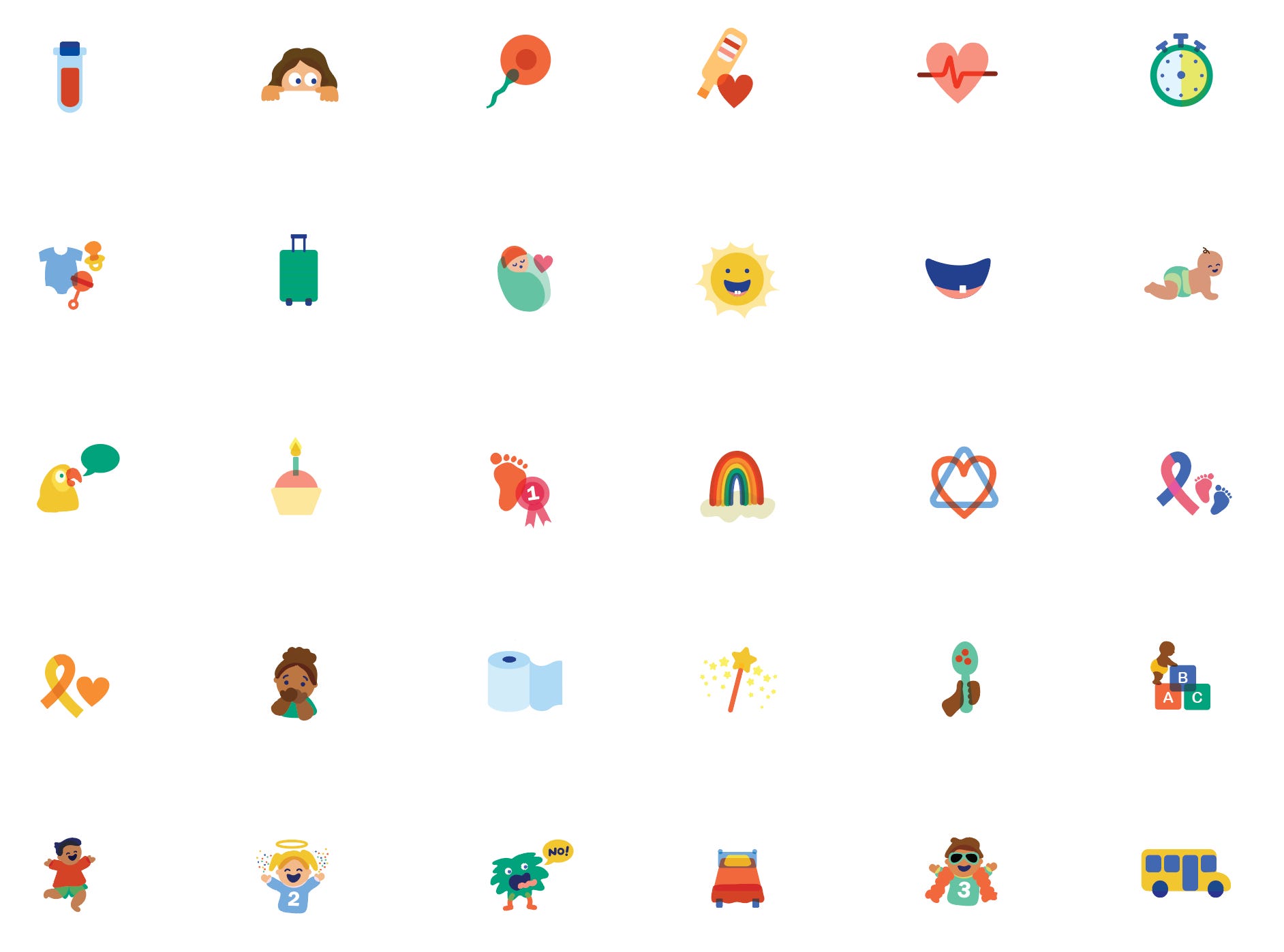
One of my favorites from this set was the icon for “potty training.” I thought back to when my kids were potty training, and they didn’t always quite make it to the potty in time. Every parent has seen a poop on the floor at some point.
This was the original icon I designed (shown enlarged):

While I thought a poop on the floor was hilarious, Babycenter’s community mods thought it might be a little too much. Designing for an online community is interesting—the audience has a strong, existing connection to the brand and also spans a huge range of ages, locations, backgrounds, religions, and more. Getting feedback from the mods was helpful for me to come up with something a bit more neutral, a good ole role of TP.
The final potty training icon (shown enlarged):

To see more of my Babycenter drawings in action, check out their homepage for the pregnancy week-by-week fruits/vegs and popular tools.
DenseBreast-info.org Mother’s Day Boobquet
Since the snoobs were such a big hit, the Lifesaving Ladies at DenseBreast-info.org invited me back to create artwork for a Mother’s Day promotional flyer to be handed out to patients in physician’s offices. They specifically asked for it to include a drawing with my style of “cheeky and fun.” Heck yes!
Snoobs were a tough act to follow, but, I love a design challenge with parameters. Thinking about Mother’s Day, flowers immediately came to mind (duh) but I thought these flowers could be a bit saucy with breast shapes in the centers and hidden in the blooms… a Mother’s Day Boobquet.
Here is the original sketch:
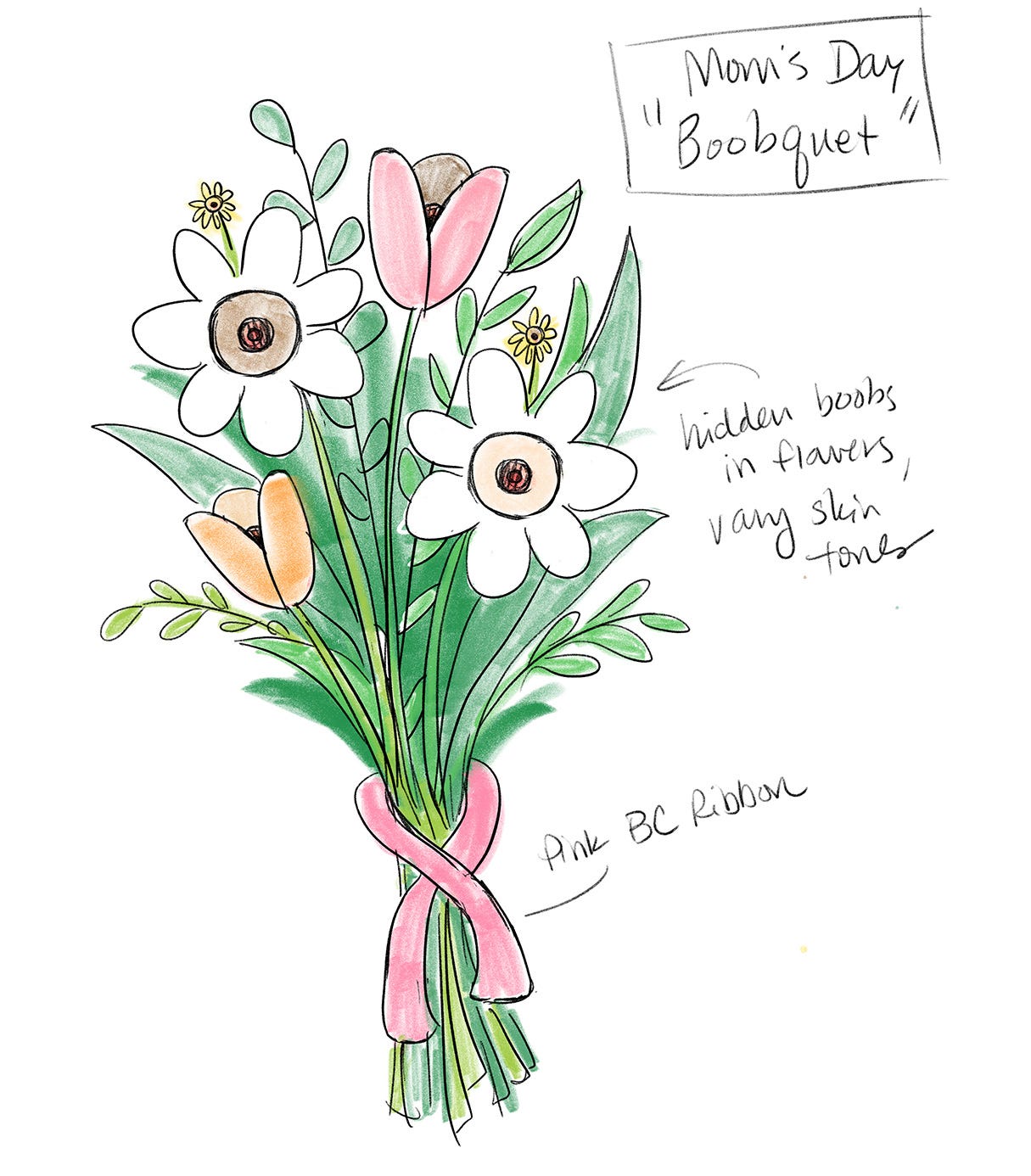
This one didn’t make it past the medical board. There was a little too much breast, so I had to scale back. How could I keep the boobquet concept, without obviously showing too much?! Where I landed was drawing a bundle of tulips, with just a hint of boobage showing in the petals. It still gets the idea across without being too much… sort of like a bouquet-wardrobe malfunction.
Approved! Here’s the final:

Hope you enjoyed this tour of what’s been on my desk. I’m also writing a newsletter series about what I’ve been doing in the analog world. I’ve made a conscious effort to step away from screens recently and engage more intentionally with the world around me. I hope I can inspire you to do the same. Coming soon!
Are you looking for creative help? I am accepting new work. Reach out to me at lori@loridraws.com.
See you next time,
xo Lori
Wowwww Lori these icons!!!